omnion.
(writing in progress)
(writing in progress)
(writing in progress)
(being written, come back soon!)
“Diabetes affects around 366 million people worldwide. According to the ‘Rule of Halves’, only half of them have been diagnosed and only half of those diagnosed receive professional care. Of the people receiving care, only half achieve their treatments targets and of those only half live a life without diabetes-related complications. Thus, while figures vary from country to country, the ‘Rule of Halves’ suggests that globally just 6% of everyone with diabetes manage to gain control of their condition and avoid diabetes-related complications. How can we break the ‘Rule of Halves’?”
– The brief, from Novo Nordisk, leading manufacturer in diabetes care.
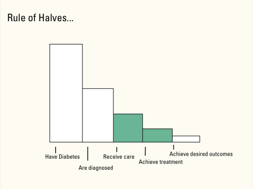
A graphic, because that brief was a little wordy.
We decided to help those who receive care (diet and exercise advice, medications, etc) achieve treatment goals. It’s always hard to maintain self-monitoring regimens, especially if daily progress is undetectable. We could have developed some way to motivate people, but instead we took this step of the Rule of Halves from the angle of providing moral support through relevant and useful information for their lifestyles. The more in-tune people are with their health, the more likely they are to be proactive in caring for it.
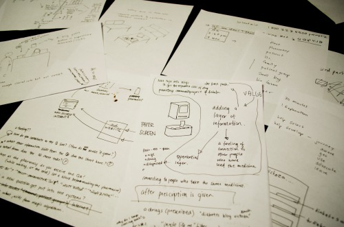
There are some good ideas hidden in there somewhere.
The idea of bringing the digital communities to our physical world was something we felt strongly about. We struggled a lot with the location of curiocity, initially placing it in the doctor’s office. Would you receive the information when you walk in? When you leave? What kind of information would be provided on these sheets? We tried excerpts from blog posts and ran into the issue of content curation. How would our magical algorithm pick out the excerpts that mention Metformin in an informative context? If the medication were mentioned in a question (and it had discussion following it), the likelihood of the question being relevant is quite high.
So what is Novo Nordisk’s role in this? In order to maintain trust between the information provider and the patient, curiocity has to be a third party service. It’s curiocity(not Novo Nordisk) that goes through online communities to pick out questions. Maintaining trust in curiocity is important so that the sheets don’t seem like promotional flyers for whatever medication they’re about. If Novo Nordisk has taken any part in curiocity’s establishment, that information should be transparent and clearly stated that the views and insights in the blogs are in no way part of the company. Novo Nordisk (or any other pharmaceutical company who decides to participate in curiocity) would be marketed as a supporter of holistic care
Although inspired and designed with insights about diabetes care, curiocity is a service that isn’t diabetes specific. It is applicable to any person who picks up a prescription of any kind. If we had more time, we would have explored how Novo Nordisk could really be part of this (what an amazing opportunity for an experience prototype!). We did end up addressing the Rule of Halves issue, but saw it as an issue with any medical ailment. I think curiocity’s process (of taking a step back and seeing the bigger context of what you’re working on) is a great way to approach any future project. There’s a lot of reimagining that needs to be done in the health care sector, and I hope we contributed a little to it.
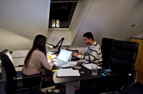
How is this the only photo of us working??
On a more personal note, I really need to learn how to use my camera better.
“Design a service that reconnects cars with the people that drive them, the destinations they head to, the cities they drive in, the places they pass, the environment they operate in…” – the brief, sponsored by Volvo.
This is a long one, so I’ll try to be concise.
The moment Kenneth, Drew, and I decided to take on “road trips” as our design challenge topic, I knew this was going to be the best month-long project ever. Our brainstorms were hilarious and sometimes inappropriate, but always relevant and fun.

I love the idea of being a “Land Pirate”.
We initially started out with this beautiful idea of creating “The Best Road Trip in the World”. We asked friends and strangers to tell us about their favorite drives, plotted them on a big map and connected all the roads. The path seemed arbitrary and shallow. The trips that people shared with us were about the pit-stops, the happy accidents, the adventures and misadventures. It wasn’t about the destination, it was about the journey.
The biggest decision we made was that our service would be most beneficial and exclusively for road-tripping scenarios. Before this, we were trying to focus on all types of long journeys, from the annual eye-roll inducing drive to grandma’s house to the post-graduation all-American cross country car ride. Eventually we settled on keeping it simple: any trip from point A to point B, with no-rush time in the middle.
We created 5 different prototypes (well, more, but I’m only naming 5).
Here they are in chronological order.
1. Evidence Illustration
How does your service look like in the world? How do people find out about it? And most importantly, what does it feel like to be part of it?

Receive stickers based on how much you participate in the service. Apparently our users are hip Caravelle travelers who enjoy ironically flat Marco Polos.
Creating these stickers made us have a discussion about the main focus of the project: is it about off-roading? Visiting points of interest? Experiences of interest? We also tried an email evidence illustration, to see what it would look like if there was a social network side to the service. After making it, we decided to not have a social network be the main hub of our service.
2. Experience Prototype I – Presentation
The next iteration of veeer was the Adventure Time button. We had this idea that maybe there was a button you have in your car that, when you press it, sets your GPS to a random road trip adventure! We presented this to the class as though the projection on the wall was the windshield of the car, and took them on a roadtrip through Denmark.

The button itself may or may not have been a recycling of a past project.
We used the computerized GPS voice to give driving directions and information about what was being seen out the “window”. That part was truly awful. We got feedback about how horribly impersonal and gimmicky it sounded; it was an experience that you wouldn’t want to have on a spontaneous adventure, which is pretty important to know too.
3. Experience Prototype II – Be the Service
We had half a week to put together the next experience prototype…how could we really make people feel adventurous without actually getting in a car? Scale it down, go on a walking adventure! Across the street from CIID is a waterfront with a garden-like water fountain area (we are next to the palace, afterall…), and we chose that space to go on a 10 minute adventure experience. We split the class in two and created maps for everyone which gave them the route from Point A (CIID) to Point B (Smoothie Station). However, 2 minutes into the trip, Group A received maps that had an optional alternate route with “experiences of interest” (people who opted into the veeer service). Group B continued on the direct, quickest path to the Smoothie Station, not knowing that Group A got a different map.

The Smoothie Station is hidden behind that lifted flap. The Smoothie Station is something we invented. It does not actually exist. Please do not head there for a smoothie.
Group A enthusiastically agreed to veeer to “Kenneth’s Breakfast Nook” (recommended by a user after a delightful pit stop) after stopping by the scenic waterfront (suggested by a user because it is a view that they see every morning on the way to work).

Even Drew is laughing and he already knows what’s coming up.

veeer: “Compliment him on his moustache and he’ll give you a treat!”

At Kenny’s.
Groups A’s veeer map tested what kind of information people were interested in. It seemed that for the waterfront, it was the story that inspired the veeering but was then irrelevant once you reached the destination. For Kenneth’s Breakfast Nook, people wanted to know more about him and the place. It’s a fine balance of when you want to create your own story and when you want to know more about somebody else’s.
Then we met Group B at the Smoothie Station.

The two teams compare maps while enjoying luxury smoothies. Kosta is upset.
That look on Kosta’s face is service envy! Well okay, maybe it’s pastry envy. Regardless, he’s jealous about the fact that he missed out and that feeling is service design gold. This experience prototype showed us that even if it seems like a silly idea when you’re presenting it to the class, you’ll never know its real value until you get people to try it. You’ll never find out if people will get jealous if they’re not included in your service.
4. Experience Prototype III – Be the Service, Seriously
We had another experience prototyping presentation coming up, which meant that this paper-based experience needed to go digital and be more realistic. At this point we had determined that veeer was something that you only turn on when you’re about to road trip. Since adventures are more fun when they’re spontaneous, veeers will only pop up when you’re within a preset distance from them. Now let’s make this on an iPhone.
We took our faculty on a lunchtime veeer. We gave them several iPhones and told them to go on a trip from A to B (CIID to CIID, one big loop around the neighborhood). I went on their trip with them (for documentation and tech backup) while Kenneth and Drew manned the command center at CIID.
Kenneth and Drew GPS-tracked the faculty from the iPhones. Each iPhone had the veeer “app”, essentially an icon that linked to a website. When they reached a certain location, Kenneth and Drew would update the website to link to a tumblr that had a collection of veeers relevant to the area the faculty were in. Each veeer had a photo, a name, a brief description, and “veeer time” (the amount of travel time it would delay you to reach your final destination). The tumblrs didn’t look like blogs, but rather “feeds” of information. And! As an experiment, we included a “user submission” section. If the faculty saw anything of interest, they could take a photo of it on Instagram; we used the IFTTT platform to have those pictures upload directly to a tumblr.
We got such a rush from this! It’s amazing how close you can get to faking a functional app! But now here was the big challenge: the car.
5. Experience Prototype IIII – Off-Roadin’
In the last two weeks, we were finally able to procure some rental cars so we could go on a real road trip. Team Veeer was excited because we could finally see some Denmark…and also, we totally won at life when we picked road trips for our project topic. I can’t believe this was a school assignment.
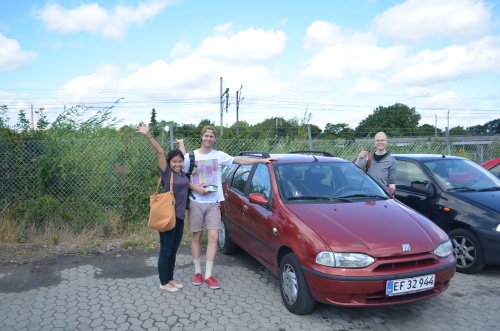
We rented a car from a place called “Rent-A-Corpse”. There was no radio.
We basically did the same procedure as the faculty city walk, but on a much bigger scale. We did a lot of research on points of interest and got to focus on exactly what kinds of user-submitted content people would be interested in. Would someone who is interested in “ancient monoliths” be just as interested in seeing “chicken inside another chicken”? Also, how would we make sure that people wouldn’t submit inappropriate things (like in Panoramio)? We went over to the Everplaces office (down the street!) to ask them about how they filter submissions, and they said that it wasn’t much of a problem. If you cater to a very specific crowd, they’ll respect the platform and self-govern. Also, we realized that we would have to stop using Instagram as a way for users to share their new discoveries; Instagram already has a certain look, feel, and use…which it not quite appropriate for what veeer is trying to do. If we created our own, we can lay our own foundations for what is expected (kind of like the unspoken rule of having high-standard photos on airbnb).
Among our many drives that tested certain aspects of veeer, our main trips were two big loops around NE Sjælland (the chunk of land Copenhagen is on). These were the final big trips. The first one was a bit of a mess, a mix of paper and digital prototypes, and the tester knew what was going on. It answered questions about timing (how far in advance do the veeers pop up?) and interface (how much information would the driver see? would veeeer live in the gps system or an iPhone?) We finally got to see how the system would work in a car and was excellent preparation for the final roadtrip.
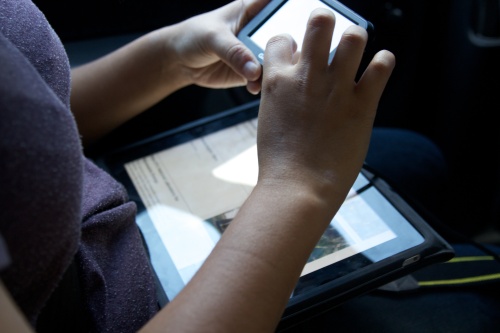
Too many interfaces to deal with.
The final adventure was the same route as the first car one, but this time the tester had no idea that veeer wasn’t an actual app. She knew it was still a work in progress, but I don’t think she knew how hacked together it was. We filmed this trip to use for our final video. Because we had already done the route once, we were able to focus on making creating a convincing experience for our tester (‘borrowing’ the iPhone at appropriate moments to make app adjustments, for example). The trip went smoothly and it was lots of fun!
We even had enough time to go for a mini trip to get extra footage for the video. I’m still baffled at how well we managed to plan out our time. Of course there were lots more decisions and prototypes made (if you’re interested in them please don’t hesitate to comment/email me) but I’m leaving them out because it’s just too much.
If you read through that, bravo! That’s some dedication. Thanks.
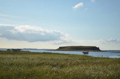
I bet you’ve never seen a cow in the ocean. We did. Thanks to veeer.
[beginning]
To tell you the truth, this one happened so quickly, I can barely remember the decisions we had to make.
The first week was full-on lectures, things we hadn’t had at CIID before. It was actually a nice thing to have, although maybe my stance on that statement was a little different towards the end of the week. We had some assignments to observe and document activity in the city (finally, we get to see a bit of Copenhagen!). I loved that part, mostly because it meant I got to drink coffee, people-watch and count things. I hated it because it was really hard being discrete about that.
It all started with a brief to improve the city.
[middle]
One evening Spitz and I sat at a ridiculously tiny table outside Tjili Pop, one of our favorite café/bars. I pulled out my sketchbook, Spitz pulled out his iPad. We discussed using street signs as channels of communication for locals, Foursquare-like competitions between parts of the city, and scavenger hunts for tourists. After squeezing our mind grapes for cringe-worthy ideas, we thought woahwoahwoah, back it up, why are we not addressing the signs themselves?! We were sitting on the corner of Rantzausgade and Jægergade. Ohmygod, are you okay, are you choking?? Oh nevermind.
[end]
Whether it was the form of the speaker or the way it was set up, there wasn’t enough affordance for people to approach the setup on their own. We needed some kind of whacky sign that nudged people to pick up the speaker and listen to the recording. I think that if we were to develop the project further this would be the part that would be tested, with more time, with more people.
Spitz built the electronics and the system using MaxMSP while I glued together the setup. It was a great exercise in knowing when to care about the details and when to move on; definitely wrap the 5′ of exposed wire in yellow yarn but don’t try to make perfect boxes for the lights because no one will see them anyway. I guess it’s a balance between integrity and saving time.

Pretty much the only process photo I can find right now.
[beginning]
Usually, we picked groups based on who we haven’t worked with. This time, Golan suggested we form teams based on the content we’re interested in. Manas suggested something with the Danish language; Kenneth and I felt that this would be a fun topic to play with…have you heard the Danish language?
The decision to tackle three languages instead of just one was purely for aesthetics. We thought it would be a more interesting project with comparisons. The ones we chose (Danish, English, and French) were the ones that were the least similar of the languages most familiar to us.
[middle]
We all chipped in on the code (usually tough with three people, but this one worked out alright). Whenever someone got stuck on something, someone else would take over. It worked out pretty great because we were all pretty novice coders.
We had a really smooth concept development phase, all taking turns being project manager and leading the next step when the other two brains got a little fuzzy. I think the fact that we all were on the same page, all the time, got us through the rough patches of coding. We faced some skepticism throughout the project. This might have been because we hadn’t communicated the idea properly during check-in chats. But Team silenc supported each other and kept on going anyway.
[end]
I really enjoyed working with Manas and Kenneth. I don’t think I fully realized how beautiful the project ended up being until we presented the final result. I think it was a great example of using a tech-heavy process to achieve a tech-less output.
[beginning]
“Make a lap, using an Arduino”, boomed Massimo from the front of the room. It’s funny how you can’t unhear certain voices; his accent kind of sounds like a hundred soft dice tumbling out of a bag. “If you need any help, just ask.” I’m going to try to code with an Arduino and one of the guys who created it is sitting across from me, casually offering help. Pretty cool for the first month of school.
During the first days of our Physical Prototyping course, we familiarized ourselves with the different sensors. I loved using the capacity sensors to dim little LEDs. Since those things essentially measure pressure, what would happen if you blew on them?
[middle]
The entire creation of the lamp was pretty smooth. Raz, Kat and I called ourselves The Dream Team (yes, I am aware of how cheesy that is). But I mean look at us, look at how well we got along!

Physically computing.
Raz was the master programmer on our team, and Kat and I worked a lot on building the body (all three of us did concept development, of course). We often checked in with each other whenever we reached a milestone and there was an incredible amount of trust in each other’s skills. See. Dream Team.
“[end]
I really love how it came out. It brings a smile to my face every time I wach the movie. I wish we had taken more photos of the lamp though, lights on and off.
We ended up submitting it to the Northern Lighting Competition. Even though we didn’t win, I’m still really proud of how we presented it (pdf to come!).

[beginning]
Similar to the start of the dist.herbed project, Zubin and I were determined to get the hang of the Processing language…with an added layer of complexity.

Just a little donation from Microsoft.
I’m really glad we had a hilarious inspiration or else coding would have been really painful.
[middle]
Zubin and I baby-stepped our way to a semi-functioning game program. We’re not very techy people, so sometimes it seemed like a sysiphean struggle…but whatever, you can’t get caught up on those things or you really won’t get anywhere.

Genuine awe.
[end]
The finale was an almost all-nighter trying to get the code to work; even our go-to programmer classmate shook his head with I-can-do-this-but-not-in-one-night defeat. HT wasn’t ready to be shown to the class the next day. Regardless, Zubin and I continued working on it until it became more game-like…and finally recorded a video of it. Retrospectively, I don’t regret a single moment spent on it! Even though it didn’t turn out exactly as we had hoped, we’re still champs for getting it to where it is now. Someday we’ll return to it, laugh at how messy our code was, and whip up a better version of the program then and there.
Or maybe we’ll just laugh and have another beer. Making a game is really hard, guys.
“Wait, did you seriously pick apart bread??”
Oh, yes. Yes, we did.
[beginning]
When Sara and I paired up, we agreed that we wanted to do a project that involved some kind of obsessive cataloging. After months of clicking away at the silver keys of our Macs, we were ready for softer textures to bring us back to reality.

Too much of this. And it says “algorithm” on the wall.
The project was a rollercoaster of !!! and ???. It felt great because we missed manual labor so much and loved our idea. It was fun and simple, but we had no clue what the result would look like! But then the questions kicked in: was there even enough time to finish the project? Initially we planned on picking apart all three loaves (I’ll take two tickets to Crazy Town, please) but soon realized we were delusional when picking apart one slice took too many hours too long. We decided to do only one slice per loaf and continued dissecting our speci-breads.
[middle]
We filled our mindless operation hours with shared music, life stories, and bad jokes. Things were great. But then we started Questioning. Is this data visualization? What are we trying to show by doing this by hand?? What are we doing?!? You know, asking the types of questions that seem legitimate and real coming from yourself but absurd when coming from your teammate. But in our hearts we knew we were on the right track, so we kept on telling each other that.
[end]
Good feelings all around, we even got a blogpost about us! A wonderful exercise on perseverance and having faith in your team.
